By Gerrald Adams, LEED AP, director Perlman Architects
This article appears in the 2024 CRACKL Fire Station Design special issue. Order the limited-edition supplement now!
We recently completed the construction of a series of fire stations we had designed for southern Arizona. The fire chief asked what we would recommend for wall art to complement the more lively color schemes throughout the station in the key spaces the occupants would use most during their 48-hour shifts
I asked about his vision for the newly built stations, and if there was any art or historic memorabilia he wanted to showcase.
There was, but nothing he thought was appropriate. He added that they have a database of several thousand photographs from staff photographers. But so many show faces of line-of-duty deaths, residents or former employees who had died, or captured a tragic event or destruction.
This, he said, was not what he wanted portrayed. His vision was to allow only photos of positive imagery and a culture to be proud of.
Focusing on Positive Imagery
This really hit home with me. I started thinking more about how we can influence a positive image in the design of the interior spaces in such facilities. By using color along with art or photos that are positive and portray a culture that is there to serve and protect, we could make a difference.
Photographs have often been used in fire stations to show a history of the heroism and destruction that firefighters face. Often, these scenes and memories become a badge of honor that represents what these men and women experience. Or maybe they are just the opposite and become a reminder of hardship and actually invoke PTSD.
Photographs can be great for training by providing glimpses of real-world situations. But they also can have a negative impact on first responders, the community, city leaders and families of the firefighters.
The Selection Process
We accepted the challenge.
We set up a website and allowed select city leaders, senior fire department staff, some residents and members of the design team to go through all the photos and choose the most positive ones.
None were to show the negative or hardship stories of years past. No firefighter faces, references to them or to civilians if they had perished. We were to avoid images of extreme disaster or destruction. The process was a bit cumbersome, but the committee narrowed this vast database to the best 36 to 40 photos to be framed and displayed throughout the facility.
The images were carefully selected and placed along walls with similar color, emotions or feelings to further the positive experience and create an art-like experience.
The Power of Color
Color is a powerful communication tool and can be used to signal action, influence mood and provoke psychological reactions. Certain colors have even been associated with physiological changes, including increased blood pressure, increased metabolism and eye strain.
Take a moment to think about a space you’re familiar with. Is there a color that stands out about that space? Think about how different colors make you feel when you see them. Perhaps the next time you are feeling kind of blah, think about this and see if your mood shifts by going to a different space or even outdoors. Many times, it’s the small things that can have the largest impact.
The scientific exploration of color psychology is relatively new, but people have long been interested in nature and the impact of color. In ancient cultures, colors were often used to treat different conditions and influence emotions. They also played a role in different spiritual practices.
While perceptions of color are somewhat subjective, some color effects have universal meanings. In color therapy, it is believed that different colors are able to impact the body differently.
The use of color in the right conditions can have a positive benefit for those living and working within a facility. Several ancient cultures, including those of the Egyptians and the Chinese, practiced chromotherapy, or the use of colors to heal. Chromotherapy is sometimes referred to as light therapy or colorology.
While more research is needed, one 2020 study published in Fatigue: Biomedicine, Health & Behavior said that chromotherapy may be an effective way to combat feelings of compassion fatigue and post-traumatic stress in high-stress environments.
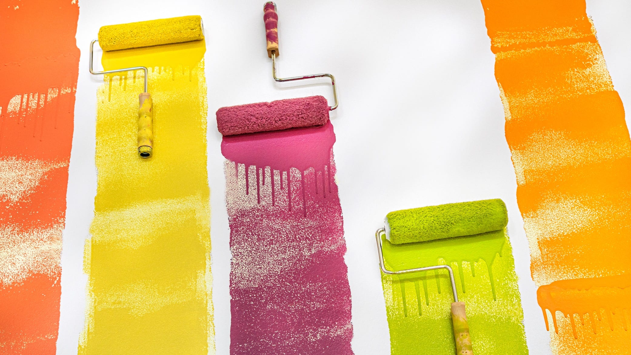
When applying these findings and the mental health benefits, the colors were chosen to best align the activities of each of the spaces. For instance, the main colors in the interior were a soft white, which provided the feeling of relief and indicated a sterile and clean environment. The fitness room and dayroom were painted in a warm yellow-orange, while the accent walls in the dorms were a dark green. The offices and training rooms had darker oranges for a more energized working area.
Other projects have used reds and yellows with darker tones in the sleeping areas and blues in common and kitchen spaces, all with great feedback.